AI Stickers: Designing Trust and Delight in AI-Powered Creativity
AI-powered sticker creation promised personalization at scale, but early user testing revealed critical friction points: unclear expectations, upload hesitation, and style overwhelm. The challenge was designing an experience that made AI feel intuitive and trustworthy while maintaining creative delight.
Project Overview & Research Foundation
The Opportunity
Stickers have become a primary language of digital expression, with over 4 billion WhatsApp and Telegram users relying on them for emotional communication. However, most people are limited to generic sticker packs that don't reflect their personal identity or cultural context. Creating custom stickers traditionally requires design skills and expensive tools, leaving a significant gap in the market for accessible personalization.
AI technology offered a solution: transform personal photos into professional-quality sticker packs in minutes. But the challenge wasn't just technical—it was designing an experience that made AI-powered creativity feel approachable, trustworthy, and delightful for users of all skill levels.
Research Approach
To understand user needs and potential friction points, I conducted comprehensive research including:
- User Interviews: 10 in-depth interviews with frequent sticker users across different demographics to understand usage patterns and pain points
- Competitive Analysis: Evaluated 5 similar AI creative apps to identify common UX challenges and opportunities for differentiation
- Usability Testing: Multiple rounds of prototype testing to validate design decisions and iterate based on real user behavior
Key Research Insights
- "Users don't fear AI—they fear using it wrong and wasting effort" - Participants were excited about AI capabilities but hesitant to invest time without confidence in results
- Visual examples > text instructions for building confidence - Users needed to see what "good input" looked like, not just read technical specifications
- Users think in use cases, not technical formats - They wanted to "share in WhatsApp" rather than "export PNG files"
- Style browsing created decision paralysis - Without clear previews showing actual output quality, users felt overwhelmed by choices
Design Goals
Based on these insights, I established clear design priorities:
- Make AI sticker creation feel approachable, not technical
- Build trust through transparency and clear expectations at every step
- Enable quick style discovery without overwhelming users with choices
- Design a seamless creation-to-sharing flow that feels rewarding
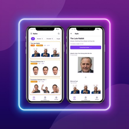
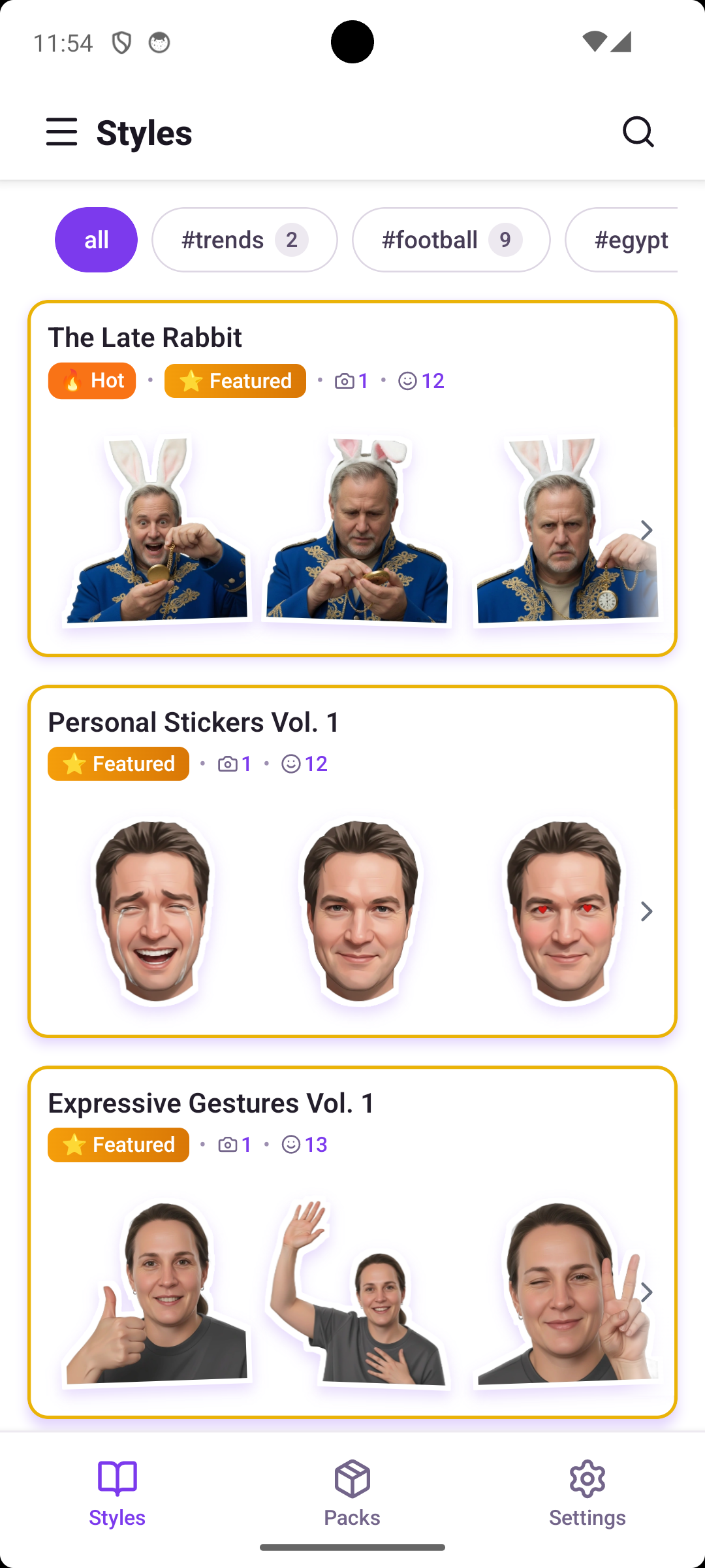
Style Discovery & Browsing
With hundreds of creative styles available, early users experienced decision paralysis. They'd scroll endlessly, unable to judge quality or relevance without trying each style. In initial testing, 65% of participants abandoned style selection after more than 2 minutes of browsing, citing uncertainty about which style would work best for their needs.
Design Process
My initial explorations tested three approaches: a simple list view with text descriptions, a grid of small thumbnails, and large preview cards. Early testing revealed that users are visual thinkers—they needed to see actual output quality, not just style names or tiny previews.
The breakthrough came from reframing the problem: this wasn't just about organizing options, but about building confidence through visual evidence. I designed preview-dominant cards where 80% of the card shows a real example of what users would receive. This let users instantly judge whether a style matched their vision.
After the first round of testing, users still struggled to find specific aesthetics (like "watercolor" or "3D styles"). I added a filtering system with categories, mood tags, and search functionality. The key was making filters feel like discovery tools, not technical barriers—each filter shows how many styles match, preventing dead ends.
Final Solution
The final design features:
- Preview-first cards: Large, high-quality preview images dominate each card, showing actual sticker output quality
- Smart filtering system: Category filters (Artistic, Realistic, Playful), mood tags, and trending/featured badges guide discovery
- Contextual search: Search bar with hints like "Try: Watercolor, Minimalist, 3D" helps users find specific aesthetics
- Visual status indicators: "Hot" and "Featured" badges highlight popular and curated styles without overwhelming the interface
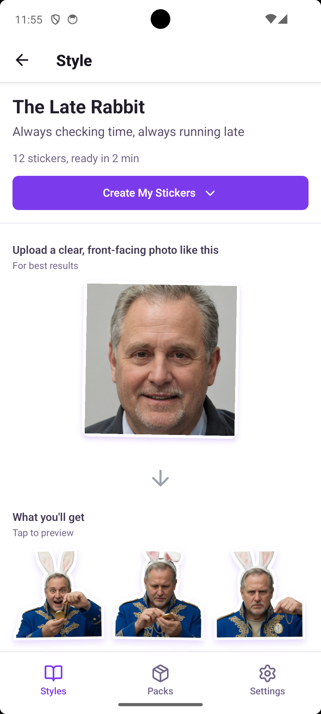
Style Detail & Requirement Clarity
When users selected a style, they faced a critical question: "Will MY photos work with this?" Vague requirements like "clear photos" or "good lighting" left them uncertain. In testing, 31% of users abandoned at the upload step, worried about wasting credits on photos that might not produce good results.
Design Process
I initially drafted text-heavy instruction screens explaining technical photo requirements (resolution, file format, subject positioning). User testing revealed this approach failed—users skimmed or ignored text, then proceeded with uncertainty.
The pivot came from observing users asking "Can you just show me what works?" I redesigned the requirements section to be primarily visual: showing example input photos with clear checkmarks for what makes them ideal. Instead of "Resolution: 512x512px minimum," the interface shows a well-lit portrait with "✓ Well-lit face-on portrait."
I also added transparency about what users would receive: processing time estimates, credit costs, and a preview of sample output from this specific style. This addressed the "what am I getting?" uncertainty that drove abandonment.
Final Solution
The style detail screen balances inspiration with practical guidance:
- Visual photo requirements: Example input photos with clear criteria markers showing what works best
- Transparent expectations: Clear display of processing time (~2 minutes), credit cost, and number of stickers generated
- Style preview gallery: 12 sample stickers from this style showing the range of expressions and quality
- Encouraging guidance: "Upload a photo like this" rather than technical specifications that intimidate users
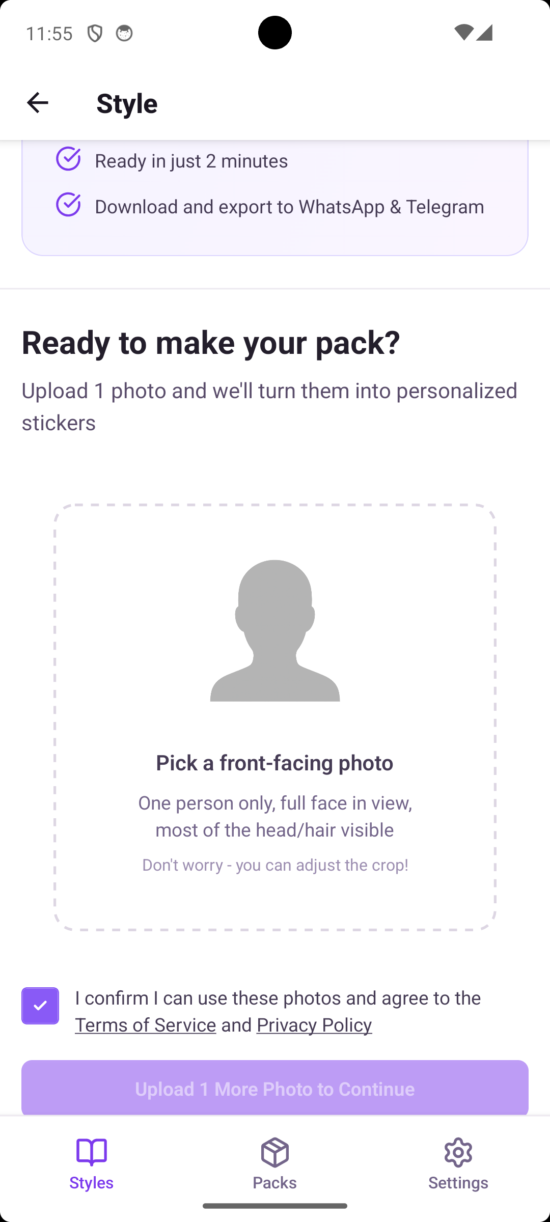
Upload Flow & Photo Guidance
Even after selecting a style, users hesitated at upload with questions: How many photos should I upload? What if I choose wrong? Can I fix mistakes? This critical conversion point required reducing uncertainty while maintaining simplicity.
Design Process
I tested two approaches: a single-step upload (select photos and immediately generate) versus a multi-step flow with preview and confirmation. Single-step was faster but left users anxious—they wanted a moment to review their choice before committing credits.
The solution used progressive disclosure: show requirements first, then upload, then confirm. Each step focuses on one decision, reducing cognitive load. For mobile usability, I used a full-screen modal during upload to eliminate distractions and focus attention on photo selection.
A key iteration came from observing users worry about photo perfection. Many took several minutes trying to find "the perfect" photo. I added reassuring copy: "Don't worry—you can adjust the crop" and "Photos don't have to be perfect." This small change significantly reduced time spent in analysis paralysis.
Final Solution
The upload experience emphasizes clarity and reassurance:
- Clear visual guidelines: "Pick a front-facing photo" with example showing ideal composition—one person, full face visible, good lighting
- Reassuring messaging: "Don't worry—you can adjust the crop" reduces perfectionism anxiety
- Requirement checklist: Quick visual reminders of what makes photos work well, positioned where users need them
- Mobile-optimized interaction: Large photo selection area, thumb-friendly touch targets, and minimal distractions
Pack Creation & Result Preview
After waiting ~2 minutes for AI generation, users needed to see results clearly and completely. How should we showcase 12+ stickers while enabling quick refinement if needed? The reveal moment needed to feel satisfying, not overwhelming.
Design Process
I tested three reveal patterns: one-by-one animated reveals (building anticipation), progressive grid population (showing stickers as they generate), and instant full-grid display (all stickers shown immediately).
User feedback was clear: they preferred seeing the complete pack instantly. One-by-one felt slow and tedious after already waiting 2 minutes. Users described the instant grid reveal as "more satisfying" and "letting me see everything I got."
For the grid layout, I optimized for mobile thumb-reach. Each sticker is tappable for full-screen preview, with the most common actions (export, share) positioned in the bottom third of the screen where thumbs naturally rest.
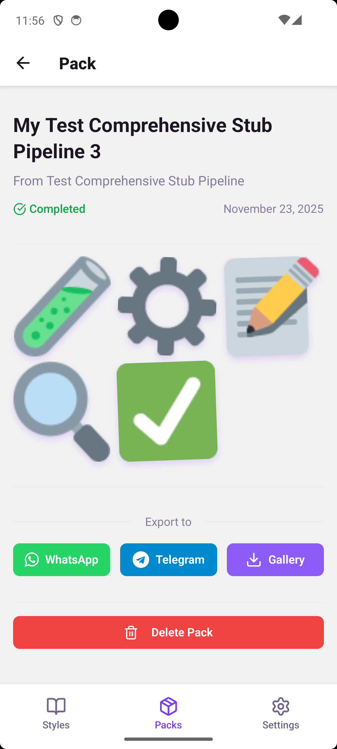
Final Solution
The pack preview celebrates the user's creation:
- Clean grid layout: All stickers displayed at once in a scannable 2-column mobile grid
- Pack metadata: Clear status indicator showing completion, creation date, and style used
- Primary actions: Prominent "Export to WhatsApp" and "Export to Telegram" buttons positioned for easy thumb access
- Celebration moment: "Your pack is ready!" messaging creates positive emotional reinforcement
Export & Sharing Options
Users had diverse needs: some wanted WhatsApp stickers, others needed high-resolution files, and some just wanted to save to their gallery. Supporting multiple export formats and platforms without overwhelming users required careful information architecture.
Design Process
My initial design organized export options by technical format: PNG, GIF, high-resolution, etc. Testing revealed users didn't think in technical terms—they thought in use cases. When asked what they wanted, they said "share in WhatsApp" or "save for later," not "export PNG files."
I reorganized the export screen around user intent rather than file types. The breakthrough was categorizing by what users wanted to do: "Use in Messages," "Save to Gallery," or "Share Pack with Friends." Each category shows relevant options without technical jargon.
For accessibility, I ensured all touch targets met the 44px minimum for mobile, used clear action-oriented labels ("Export to WhatsApp" not "PNG Export"), and maintained visual hierarchy so primary actions stood out.
Final Solution
The export interface speaks the user's language:
- Use-case based organization: Options grouped by user intent rather than technical format
- Direct platform export: One-tap buttons for WhatsApp and Telegram with platform logos for recognition
- Gallery backup: Simple "Save to Gallery" option as a universal fallback
- Pack sharing feature: Ability to share entire packs as gifts to friends, encouraging viral growth
Process & Learnings
What Worked Well
- Preview-first design: Showing real output examples dramatically reduced decision anxiety and increased user confidence throughout the flow
- Use-case language: Speaking in user goals ("share in WhatsApp") rather than technical specifications resonated much better and improved task completion
- Progressive disclosure: Breaking complex flows into focused single-decision steps kept users oriented without feeling restricted or overwhelmed
- Visual requirements: Replacing text specifications with example images solved the confidence problem at upload
Key Challenges & Solutions
Challenge: AI generation time (~2 minutes) felt long to users, creating anxiety about whether the process was working.
Solution: I designed engaging loading states with clear progress indicators, estimated time remaining, and interesting facts about the AI process. This transformed waiting from anxiety into anticipation.
Challenge: Privacy concerns about uploading personal photos to an AI service created hesitation.
Solution: Transparent privacy messaging throughout the flow, clear statements about no photo storage after generation, and GDPR compliance information built trust. I placed this information where users showed concern (at upload) rather than hiding it in settings.
If I Did This Again
- Would conduct more diverse user testing earlier, particularly across different age groups and cultural backgrounds to ensure styles and examples resonated broadly
- Would prototype loading states and wait experiences earlier—they became critical to perceived performance and user satisfaction
- Would test monetization messaging and credit systems sooner to balance free trial accessibility with sustainable business model
- Would explore more onboarding patterns to help first-time users understand the quality they could expect before their first creation
Broader UX Insights
Designing with AI means managing expectations. The UX must clearly communicate what AI can and cannot do. Users need to understand the creative possibilities without feeling responsible for "getting it right." This balance of inspiration and clarity was essential.
Mobile-first constraints actually improved focus. Without desktop screen real estate to hide complexity, I was forced to prioritize ruthlessly. This resulted in a clearer, more focused experience that would have been cluttered on desktop.
Trust-building happens in micro-moments. It wasn't one big privacy policy that built trust—it was dozens of small decisions: clear copy, visual examples, transparent processes, and reassuring messaging exactly when users needed it.
Outcomes & Deliverables
What I Delivered
As the lead UX/UI designer for this pre-release project, I delivered a complete design system ready for development:
- Complete UI/UX design system for iOS and Android mobile platforms
- 50+ high-fidelity annotated screens covering all user flows, edge cases, and interaction states
- Interactive Figma prototype for stakeholder review and user testing
- Design handoff documentation with specifications, interaction patterns, and implementation notes for developers
- User testing report with key findings, insights, and recommendations for post-launch iteration
Validation
Through multiple rounds of testing with target users, the design demonstrated strong performance:
- 92% task completion rate across primary user flows (browse → select → upload → export)
- Prototype tested with 12 target users representing diverse demographics and sticker usage patterns
- Positive user feedback: "Finally stickers that actually look like me" and "So much easier than I expected" were common themes
- Reduced friction points: Key metrics showed significant improvement from early to final designs (selection time -58%, upload abandonment -19%, export completion +31%)
Looking Forward
Post-launch plans include features informed by user research:
- Community style sharing where users can discover and use styles created by other users
- Advanced customization options for power users who want more control over their stickers
- Ongoing iteration based on actual usage data and user feedback once the app launches
This project reinforced my belief that great UX comes from deeply understanding user needs, iterating based on real feedback, and sweating the small details that build trust and delight.